It’s Comics, but it’s not Comic Sans!
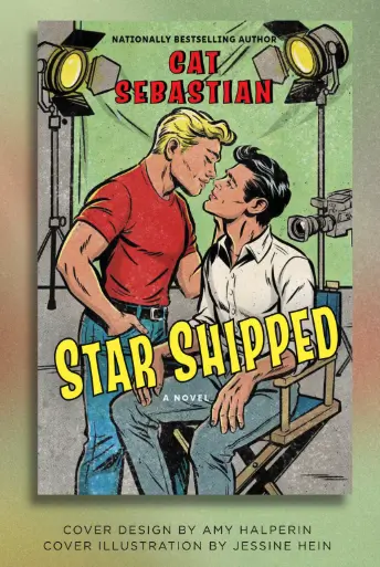
Recently Cat Sebastian revealed on Instagram the cover for her new book, Star Shipped, coming out in March 2026:

Vintage comic style! I dig it. It conveys an era without being exactly specific, and it’s a style that’s nostalgically familiar.
I’ve noticed this style as a growing trend in romance. Now, usually when I notice a trend, it’s after two similar occurrences. That’s a coincidence, I know. This is NOT a coincidence – this is most definitely a trend. Let’s take a look!
I think (I may be wrong here – feel free to correct me) that the book that kicked off the trend was Lyla Sage’s Done and Dusted:

Followed by Swift and Saddled:

And, of course, Lost and Lassoed, followed by Wild and Wrangled:


The colors, the textures, and the line art are great replicas of vintage comics.
Cash by Jessica Peterson also uses this style, particularly the texture:

And in December, Duke will come out:

I’m kinda fascinated by the use of the hats to hide their faces, since faces can be (I am told) difficult to draw – I certainly can’t do it.
I’ve also seen the hat-hiding-faces illustration style on Dust Storm by Maggie Gates, though I confess when I saw the image in a small size, I thought he was wearing a potato:

Do you see what I mean? Maybe it’s just my weird brain. Here’s the full-size cover, which is not a potato.

Contemporary Western romances aren’t the only books getting the vintage style on the cover: Fan Service by Rosie Danan also uses this technique.

The background is not quite as textured, but the line art style is similar, I think.
Then, coming on October 25, we have two more books with vintage comic-style illustrated covers!

Not as much of the texture, but the line art fits.
Cowboy It’s Cold Outside by Maisey Yates is part of the Four Corners Ranch series – and the above cover is a bit of a departure from the prior eleven books in the series, which had photograph covers:


The last book in my “It’s Comics, But it’s Not Comic Sans” collection:

The Devil She Knows by Alexandria Bellefleur is a neat mix of the textured comic style inside the elevator, and a more matte finish on the wall around it. I really like how their expressions are rendered, and the subtlety of the shadow – and the tag line, “Going down?”
10/10. No notes.
Have you seen vintage comic style covers making a strong comeback? What titles have you noticed?
And what do you think of this style?