
Welcome back to Cover Awe!
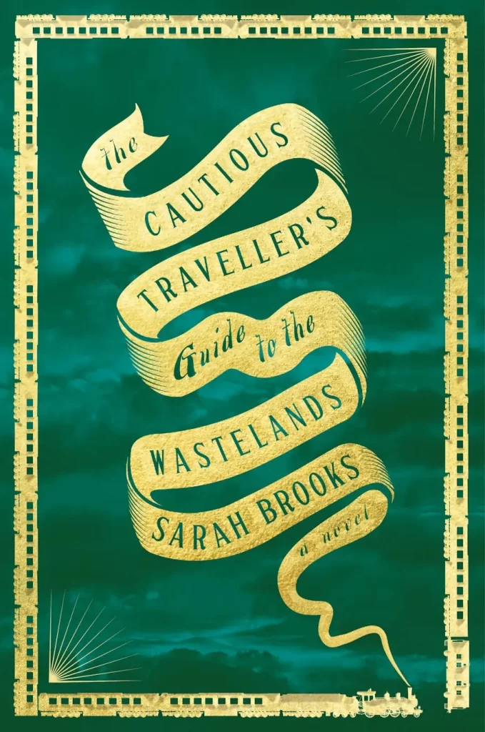
The Cautious Traveller’s Guide to the Wastelands by Sarah Brooks
Cover design by Donna Sinisgalli Noetzel
Amanda: I love how simple and thought the design is with the train border and smoke turning into the title.
Sarah: That border is So NEAT.
Lara: I’m loving those rich colours too.
Sarah: I love these collections of covers. So many pretty details to look at. The simplicity still says so much about the book. Love it.
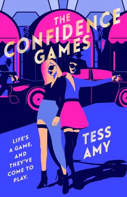
The Confidence Games by Tess Amy
Cover illustration by Yordanka Poleganova
Sarah: I can’t decide if I like this. It’s eye catching and very bi-color-flag noir almost.
Tara: I like the colours, but I think it could be much more effective with a few tweaks.
Sarah: It kind of reminds me of what my eyelids look like when I stare at something bright and then shut my eyes. Almost like it’s a negative?
Tara: Yeah, it has too much going on and too many elements blend together with the darkest colour (it especially irks me that the hair on the person on the right blends into a jacket and… a door? Who can say.). The title text also runs over colours that are too light in some spaces. So, overall, it forces the eyes and brain to struggle a little too much.
Sarah: I wonder if the overexposed sort of feeling is deliberate?
Tara: That’s a great question. It might be! I’m hoping so at this point, because I can respect it as a deliberate choice, even if I don’t love how my eyes keep bouncing around and don’t know where to land.
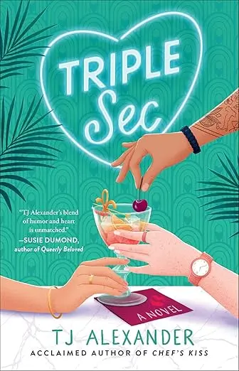
Cover illustration by Petra Braun
Amanda: I love the subtle hint that this is a poly romance.
Shana: Oooh, I love the color combinations too.
Elyse: This is the kind of illustrated cover I’m here for.
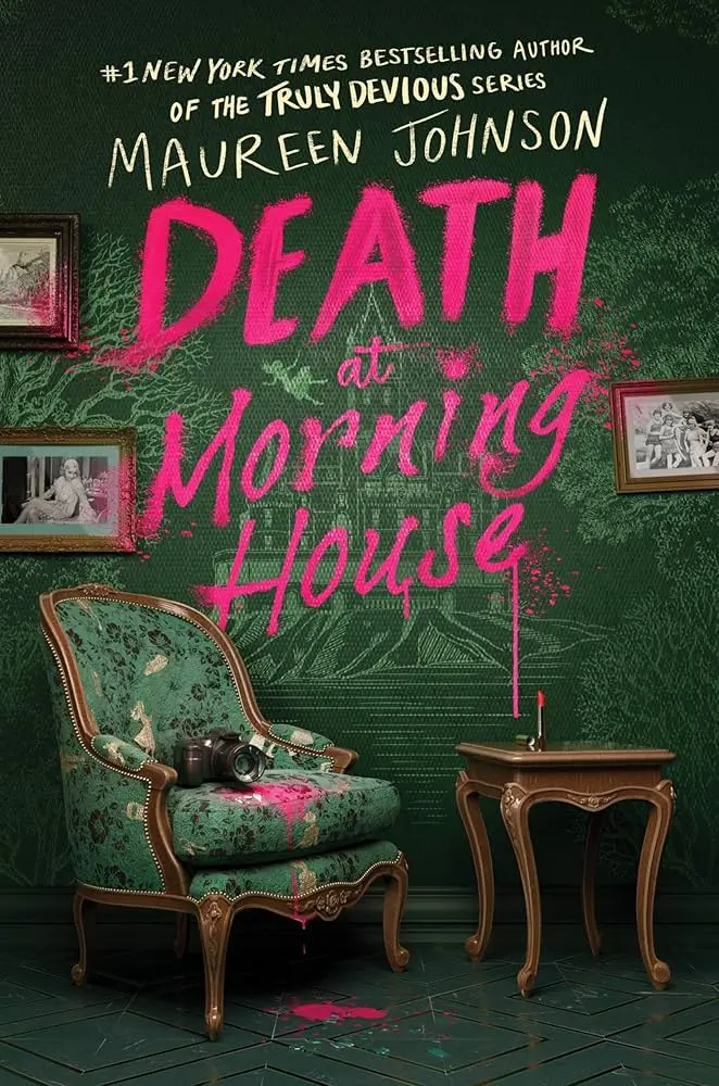
Death at Morning House by Maureen Johnson
Cover art by Sasha Vinogradova
Elyse: The green and hot pink is such a distinctive combo.
Tara: I really like those together.
Sarah: The color palette, the lighting, and the modern spray paint on antique furnishings are all genius.