Supporting writers and readers costs money—$500,000 a year, to be precise—and we need your financial help to sustain our work. Today, we’re asking you to give Electric Literature the gift of another year. We need to raise $35,000 to get us through 2025 and balance the budget for 2026. In these challenging times, we need our community to step up. The world is a better place with Electric Lit in it—let’s fight to keep it that way. DONATE NOW.
Electric Literature is pleased to reveal the cover of Place Envy by Michael Lowenthal, which will be published by Mad Creek Books on February 6, 2025. You can pre-order your copy here.
Growing up in places where his family had no past, and met mostly with silence from his Holocaust-refugee grandparents, Michael Lowenthal longed to be from somewhere. Then he realized he was gay and felt displaced from his own displaced family. Place Envy—his first book of essays after five acclaimed books of fiction—chronicles his quest for orientation in the world: as an agnostic Jew, as a queer traveler and lover, and as a writer who can tell or twist the truth. Yearning for a queer lineage, he obsesses about an uncle who perished at Bergen-Belsen but then finds, in his grandmother’s German hometown, a more surprising legacy. He lives with a Pennsylvania Amish family; accompanies blind gay men on a Mexican cruise; plays jazz with Sun Ra, the Afrofuturist who claimed to hail from Saturn; and pursues a clarifying love affair in Brazil. Collectively, these essays recount Lowenthal’s many journeys of dislocation and relocation: to foreign countries and subcultures and to the riskiest shores of family and self.
Here is the cover, designed by Adam Bohannon:

Michael Lowenthal: As a kid, I attended a summer camp whose highest achievement rating, awarded for mastery of various survivalist skills, was called the Pathfinder. The orienteering test involved being blindfolded and then driven miles and miles from camp, where you were deposited deep in the Vermont woods and challenged to hike home—alone—aided only by a compass and half a dozen topographical maps. (How, how, did the camp ever secure insurance coverage?) In prep for the test, I spent hours poring over topogaphical maps, until eventually they seemed a kind of holy scripture, imbued with both terror and the prospect of salvation.
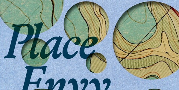
When I saw Adam Bohannon’s early iteration of the Place Envy cover, featuring a map—albeit one of a different sort, more mythological and almost campy—that old, charged image of a topographical map came immediately to mind, and I asked if we might explore it as a design element.
Because Place Envy takes a broad view of the idea of place—as a matter not just of geography but also of identity, belonging, and sexual (as well as spiritual and familial) orientation—the publisher and I worried that a map might come across as too literal and limiting. It was thrilling, then, to see Adam’s savvy, expansive, and visually upending treatment of the element.
By revealing the map only through unevenly spaced cutouts (I think of them as peepholes through which we glimpse a mysterious and fundamentally unknowable terrain), the design suggests that place is often difficult to see and conveys the challenge of orienting ourselves in relation to the world. It’s not just summer campers who struggle to be Pathfinders.
I love especially how the glimpses of the map that we do see reveal so little about their real-world location. Where is this a map of? I have no idea. The one visible word, in the upper left-hand corner, is not legible to me. Its second and third letters suggest a language other than English, and I’m not even sure how I’d google the word, if I wanted to (which I don’t).
Beyond all this high-concept stuff, I also find the design simply beautiful to look at. I’ll be so proud to see it on my shelf.
Adam Bohannon: First off, the title is really great: evocative and open to different interpretations and “readings.” The subtitle does a really great job of supporting that and also providing focus. From my “designer’s view,” the text is about journeys + diaspora + queerness + finding + return. And, every cover design is its own journey, so off we went. This one started out in some completely different places in the first round. Compass roses, uncanny architectures, disruptive imagery, and a 1920 imaginary map called the Anciente Mappe of Fairyland were all starting points.
Like a lot of things in design life, that map ended up being a point of departure. The map was interpreted as being a little too vintage + maybe giving too much J.R.R. Tolkien. But, still, the treatments I gave to that opened up the author’s mind and gave us the idea of topographical maps, which could serve as stand-ins for “place.” Layering pieces of the topographical maps on different textures and colors gave us some options. And we went from a purposeful flatness in those designs to the layered “eye fake out” that we see in the final design.